Writing effective alt-text
We use alt-text to describe images to screen reader users (including people with visual impairments, blindness, and dyslexia). Alt-text is also used to access information when the Internet's slow or an error occurs while loading the page. Thanks to alt-text, the key information in the image remains accessible to everyone.
If you work in digital, you might think you already know about this. But errors with alt-text are among the most common issues in accessibility. I had to correct several of them in my portfolio after an accessibility audit. So it’s not as easy as it looks. That’s why I’m offering some tips to help you avoid future mistakes.
Consider the context
Before anything, ask yourself whether the image needs alt-text or if it’s just decorative. Alt-text should be provided when the image conveys essential information that is not already covered in the nearby text.
For example, imagine a title "Tamara's wolf park" next to a photo of wolves in an enclosure. An appropriate alt-text could be: two wolves in an enclosure near a tree. Here, I indicate the number of wolves and their surroundings, as this information is not provided elsewhere. However, if this information was already covered somewhere, then the image would be considered decorative, and the alt-text could remain empty.
The trick is to test the page with a screen reader. If you hear the same phrase twice (in the main text and the alt-text), then you need to change something.
-min.avif)
Don’t automate alt-text writing
Some people try to save time by assigning a default alt-text in the image settings, just in case it’s needed. However, this approach doesn’t always work. An image might be reused multiple times on the same site (or page) and may not always carry the same meaning. This is often the case with icons, for instance.
Consider the following examples where I use the same printer icon three times:
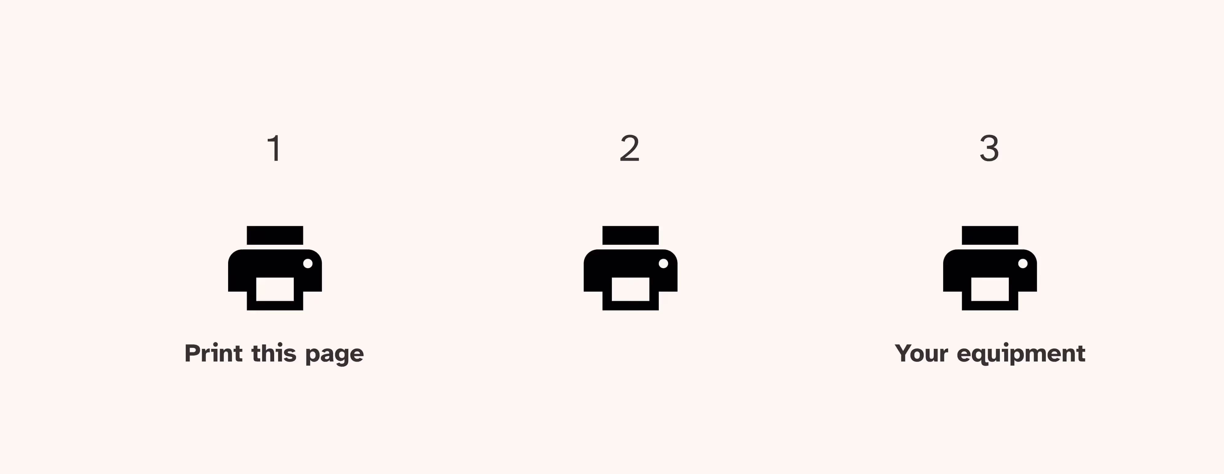
- 1st example: the icon indicates to the user that they can print the page. Here, the alt-text is decorative, as the nearby text already specifies that.
- 2nd example: the icon is used without any nearby text. In this case, it’s necessary to describe the purpose of the image in the alt-text.
- 3rd example: the icon is next to the text “your equipment.” If the user has only one type of equipment, the alt-text can remain decorative. But if there can be more, then you need to describe it's about printers in this case, either in the alt-text or the nearby text.
Don’t exceed 80 characters for alt-text
I often read that screen readers cut off alt-text beyond 80 characters. For example, the NVDA screen reader stops reading after about 90 characters, and it has to be restarted manually (by pressing the down arrow key). However, when the screen reader resumes, it announces that it's an image each time, making the text much less clear.
But even if screen readers could read out a long alt-text in one go, you should consider whether it's the right place for this information. Wouldn't it be clearer for all users to have it in the surrounding text? This is especially relevant for graphics with a lot of information. In such cases, it’s often necessary to combine a short alt-text with a longer image description in the nearby text.
Alt-text should not be used to boost SEO
You might already know this, but I’ll say it again because I recently heard it as a tip from the audience in a webinar. Some people think that adding keywords to alt-text can improve SEO. While using relevant keywords to describe an image can contribute to your SEO efforts, keyword stuffing is considered spam by Google.
Example:
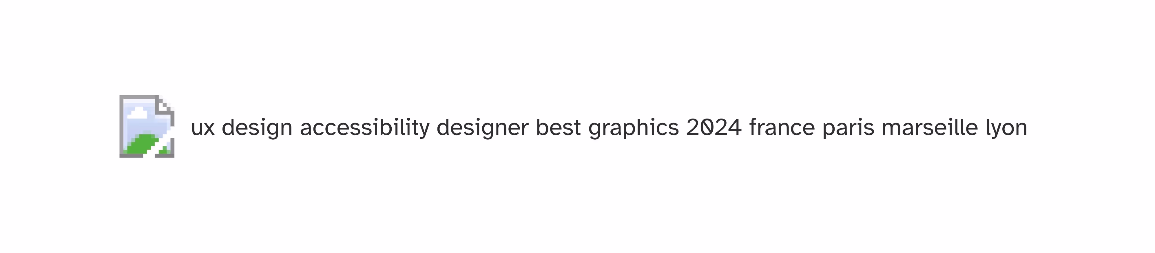
You don’t need to see the image in this example to understand that this alt-text is entirely useless.
Good to know
You can add alt-text for SEO and make screen readers ignore it. But make sure an expert helps you out with this or you risk getting flagged by Google for keyword stuffing.
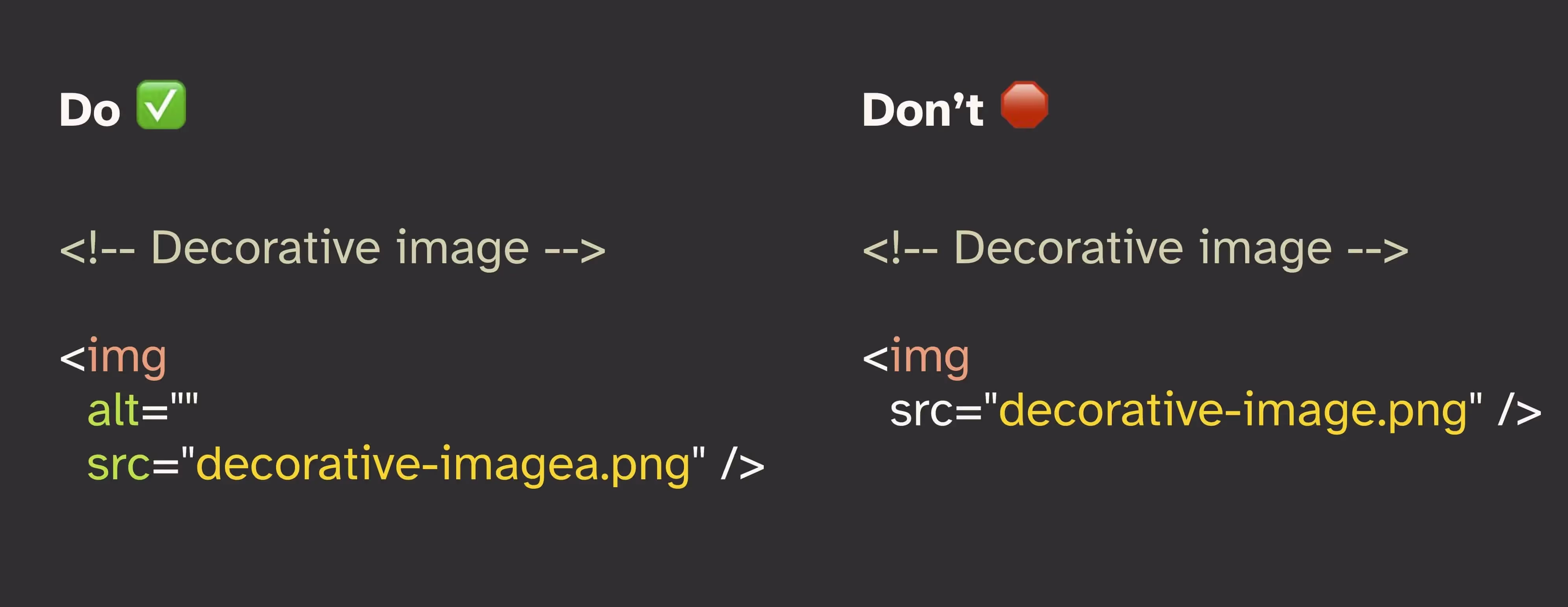
A decorative image doesn’t mean you should skip the alt text entirely
This point is mainly for developers. But it can be useful for everyone to know for effective collaboration across roles. If your designer indicates that an image is decorative, then the alt-text should be empty (alt=""). However, be careful not to confuse an empty alt-text with a missing one. The image should always have an alt attribute, whether it’s empty or filled in.
More tips for writing effective alt text
- The W3C Decision Tree: when in doubt, this decision tree helps you determine if alt-text is needed and how to write it correctly.
- Generating alt-text with ChatGPT: if you struggle to describe an image, use AI tools like ChatGPT. You can upload your image and ask it to generate suggestions. You might need to specify the length and adjust a few details, but this can save you time.